Color combinations are very important in our life. With the help of color, a huge amount of information is transmitted non-verbally. This can be especially important when you need to make a first impression, to establish contact. Through color, you tell more about yourself, as people subconsciously judge the colors of clothes faster than other aspects of your appearance. The combination of colors in clothes is a very sophisticated way of conveying information about you.
Earlier we published an article on how to choose a color according to the type of your appearance. Having decided on the main color, we suggest moving on to the next step in choosing your ideal look. We'll look at some guidelines that can be used to make color combinations interesting and eye-catching.
- How many colors can I use?
- How does color combination work?
- What is a color wheel and how can you use it to color your clothes?
- Analog colors
- Complementary colors
- Split complementary colors
- Triadic colors
- Other color combinations
- Monotonic chromaticity
- Monotonic achromatic scheme
- The combination of colors in clothes – video
- Examples of color combinations in clothes – photo
- Finally
How many colors can I use?
It is difficult to give an exact answer to this question, but in general it can be said that less is better than more. The risk of failing and looking silly in using too many colors is great.
Too many colors make you difficult to perceive, as too many colors that require attention are tiring for the eyes. On the other hand, too few colors can be, on the contrary, boring, although this is not always the case.
One general rule that you can't go wrong with is the use of 3 colors.
How does color combination work?
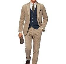
- Main color: This is the main color of the garment. He will take up most of the look, and set the tone for the outfit as a whole. For example, a black classic suit.
- Secondary color: This is the second most commonly used color in your outfit and is usually the main color. For example, a shirt.
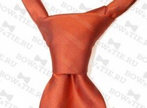
- Highlight color: This is a color that is used to highlight certain parts of your wardrobe. Typically, this is a color that contrasts with the base and secondary colors and therefore should be used with restraint. For example, an accessory. It is customary to use complementary or split complementary colors (see below).
You can and should use color combinations for any outfit you wear, be it casual attire, business casual at work, or formal dress code. There are certain combinations that are suitable for formal wear, and there are those that are more suitable for casual or sportswear. Usually, darker colors are considered formal, and brighter colors are considered for sportswear or leisure wear.
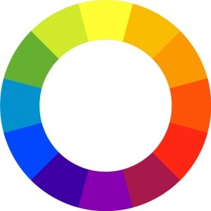
The most famous and surefire tool for matching colors correctly is the color wheel. The color wheel is used not only for art but also for clothing and is the result of many, many years of experience.
What is a color wheel and how can you use it to color your clothes?
The color wheel is a circle on which the most saturated spectral colors are located and they are located according to the color of the rainbow. 7 primary colors in a specific sequence. Remember the proverb: Every (red), hunter (orange) wants (yellow) to know (green) where (blue) the (blue) pheasant (purple) is sitting. There is nothing wiser than nature!
 Color wheel
The color wheel is very useful when you want to match colors in a way that is pleasing to you and those around you. Next, we'll take a look at some of the most common color wheel combinations. The choice of colors using the color wheel is very simple, and most importantly useful for people who do not know how to look better. Of course, some people can choose colors according to their own taste, but if you analyze their successful combinations that they make, you will see that they follow the same rules, only on an intuitive level.
Analog colors
Analog colors are colors that are one division from each other. These are the most common color schemes in nature. The outfit, which is selected using these colors, is harmonious. The secondary color, as described above, can often be an analog color.

To set which two colors are analog, select a color, skip one and select the next. The two selected colors are analog.
Complementary colors
Complementary colors are colors that are directly opposite each other on the color wheel. Complementary colors contrast with each other. Often, complementary colors can be used as highlights (described above).

Split complementary colors
Using split complementary colors will give you an outfit with a high degree of contrast, but not as saturated as the complementary color. Splitting complementary colors produces more harmony than using direct complementary colors.

Split complementary colors are a combination between two analog colors, and a complementary color from that located between two analog colors.
Triadic colors
Triadic colors are three tones equidistant on the color wheel. If you want a vibrant and balanced outfit, a triadic color scheme might be the way to go. (Note that these are only combinations illustrating the hues we are combining. Most color schemes offer different saturation variations).

Triadic color combinations are spaced equidistant from each other. For any color, skip three (in this case), or 7 if using a 24-color color wheel.
Other color combinations
In addition to the color combinations described above, which are based on the positions of the colors on the wheel, there are several other types of color combinations.
Monotonic chromaticity
A monotone color scheme is just one color and its variations in terms of hue, shade, and saturation. Using saturation and hue tint color variations is always a good option. However, in most cases, we do not recommend using a completely monochromatic scheme, as there is a risk of uniformity. However, using this scheme with black or white may look beneficial. And that's the only way he can look good.
Monotonic achromatic scheme
Monotone achromatic color scheme is a monotone color combination that consists only of neutral tones (such as gray, beige), black, white. An outfit with this color combination can look spectacular, but it can also be boring. Using an achromatic scheme with one bright color highlighted can be very effective.
Also, we should talk about black and white in clothes. Black and white are not considered colors, and in the fashion industry they are referred to as neutral shades, as we specified above, these are beige, gray, etc.
We do not recommend wearing only neutral colors, but it must be said that black and white are the only combinations of neutral colors that can be recommended.
Brown is also considered a neutral color in fashion. Brown belt, jacket, shoes, go with everything. In fashion, silver and gold are also considered neutral colors, so you can mix them. A gold bracelet can be worn with a silver one, even if this is not entirely customary.
The combination of colors in clothes – video
Examples of color combinations in clothes – photo
 The combination of purple orange and green
  Combination of yellow, blue and purple
  Combination of green and orange
  Combination of green, yellow and purple
  Combination of green, orange and blue
  Combination of green, orange and dark blue
  Combination of green, orange and purple
  Combination of orange, yellow and blue
  Combination of gray, beige and purple
  Combination of gray, green and orange
  Combination of gray, orange and purple
  The combination of dark green, light green and blue
  The combination of dark green, purple and orange
  The combination of dark blue, purple and yellow
  The combination of dark purple, yellow and blue
  The combination of dark purple, purple and beige
  The combination of purple yellow and gray
  Combination of purple and orange
  Combination of purple, yellow and blue
Finally
You now have information about the color wheel with examples. The next time you choose colors and shades, follow these guidelines and you will look your best.
Using this information will definitely help you change your appearance for the better. Create your own style and feel free to experiment. Good luck!